SaaS App Design Basics: How to Build Digital Product UX

A Guide to Crafting SaaS User Experience Design

Thanks for checking this out

Bicoastal is a product design agency specializing in SaaS Web & Native Mobile Apps, Product-Led Growth, and Website Design. Learn more about our services and reach out to collaborate or ask questions .

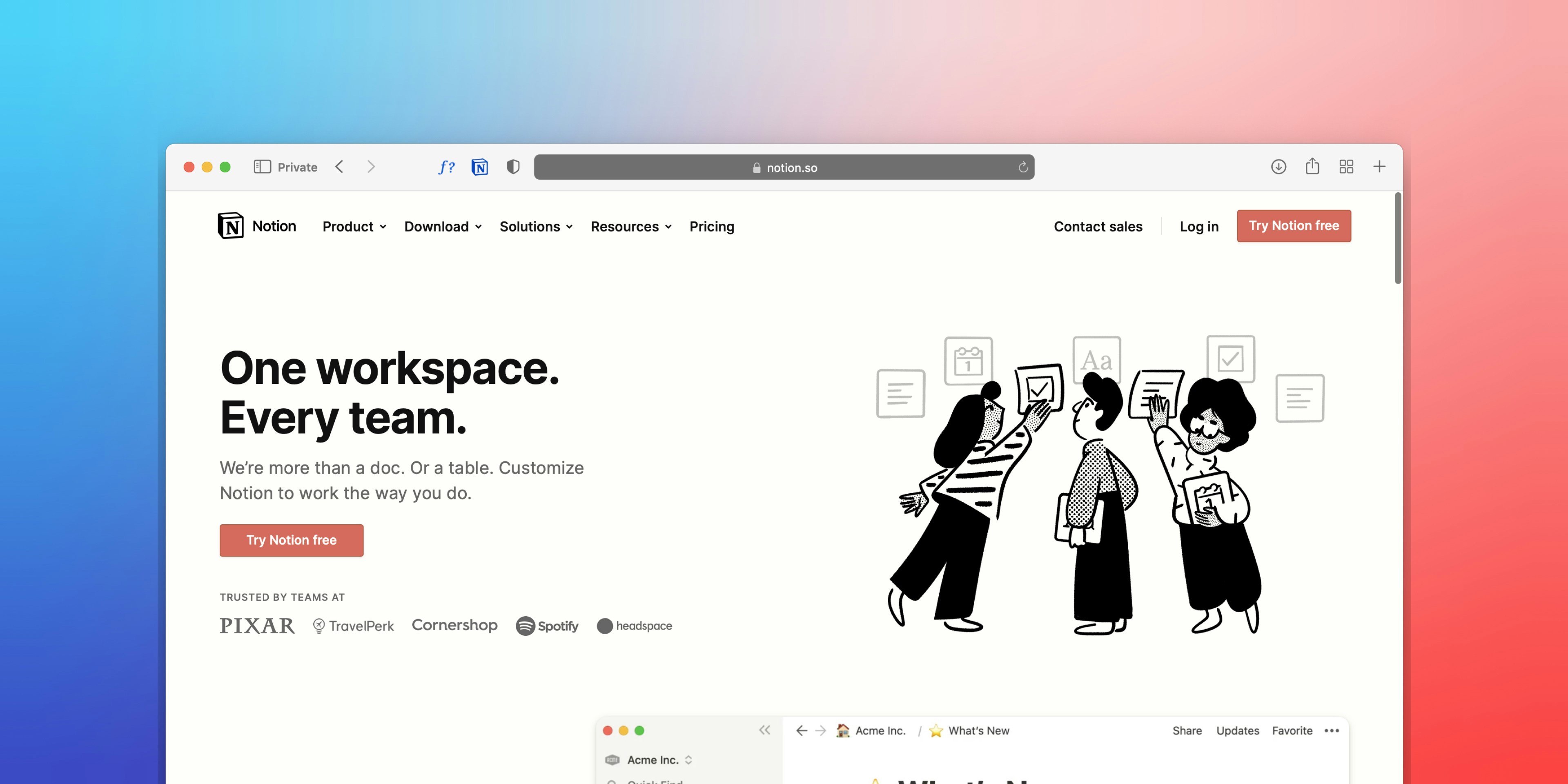
An image of notion.so landing page

Photo by Team Nocoloco on Unsplash

What is SaaS Software?

SaaS, or Software-as-a-Service, refers to online platforms that people can subscribe to. Companies host tech products people access with web, desktop, or mobile apps.

Instead of installing and maintaining software a consumer, people access their apps online. SaaS companies takes care of access, availability, security, and performance of the app experience.


Why User Experience (UX) Matters in SaaS UX

SaaS products need to provide a positive customer experience to succeed long-term. Creating a clear user interface lets people do what they want. Designing SaaS is about offering a great UX on every supported platform .

Good software should feel approachable, and provide consistent customer value. Balancing the product experience to attract and keep users. Positive real user engagement reduces friction, lowers churns, and builds customer loyalty.

UX & UI are at the heart of successful SaaS products, unlocking:

  • Improved product engagement and user satisfaction

  • Better first-time user onboarding experiences

  • Increase revenue with optimized conversion funnels

  • Setting apps apart from the rest of the market


9 Best Practices for SaaS UI/UX Design
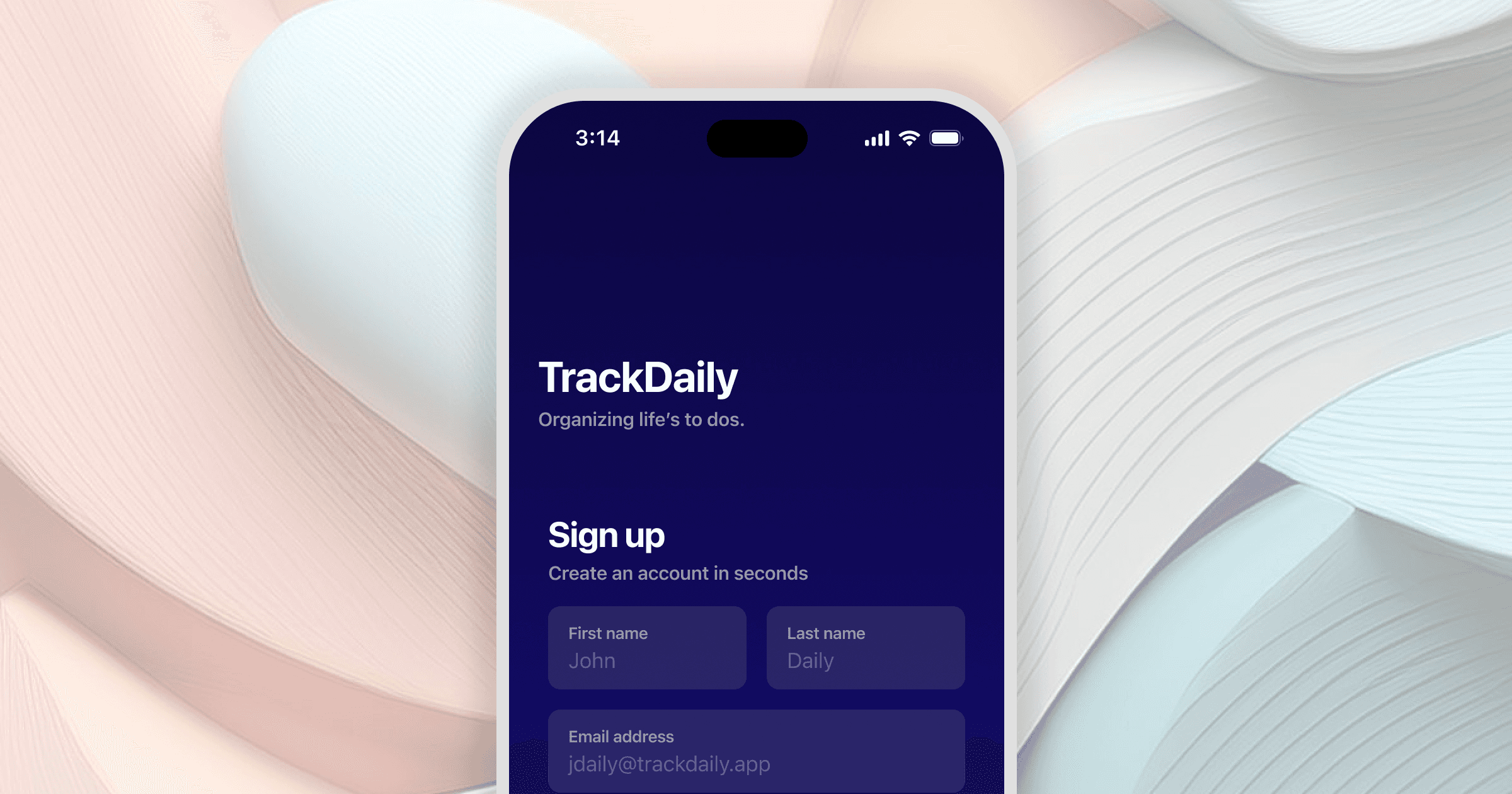
A native IOS app sign up screen

How to make your software user-friendly

Create a simple and engaging onboarding experience. The user signup process is the first impression for your users. Design a simple and engaging user signup process, get users started quickly. Introduce users to your product, and provide guidance for them to get the most of your software.

Think about grouping similar information into smaller chunks. Long forms can be overwhelming, improve conversion a few short forms and communicate progress. Measure how many users enter your signup flow, how long it takes them to complete each step, and the completion rate. Use these metrics to improve your onboarding UX over time.

How to improve user flows

Provide user-centered experiences with customized experiences. Understand what jobs your users are trying to accomplish, and what it takes to achieve them. Find ways to improve that workflow for your user-base with help and reduced obstacles.

Think of ways you can empower your audience to achieve better outcomes. Analyze key user flows for time-spent on each step and completion rates. Engage with your community to understand ways to improve specific workflows, and measure customer satisfaction. Consider adding shortcuts to complete commonly used workflows.

An image of a user persona

How UI design impacts ease of use

Make familiar user interfaces to improve their ability to navigate your tech product. Apply best practices for different device types. Use consistent UI design patterns to reduce the learning curve for new users.

Consider what platforms support your application. Design experiences that adhere to usability best standards for each platform. Different operating systems have their own design best practices. User experiences that are familiar, are easier to learn and navigate.


How to drive engagement with empty states

When people access your product they may not have information to fill out parts of the interface. Provide users guidance with empty states. Get new users set up with tips and examples along their journey. Take the opportunity to guide and delight your users.

Think about what actions users should take, to get the most out of your product experience. Provide empty states to communicate the outcome and value of certain steps. Test out different versions of your empty states to see which ones increase feature engagement. Be careful to balance user satisfaction while guiding customers through their user journey.
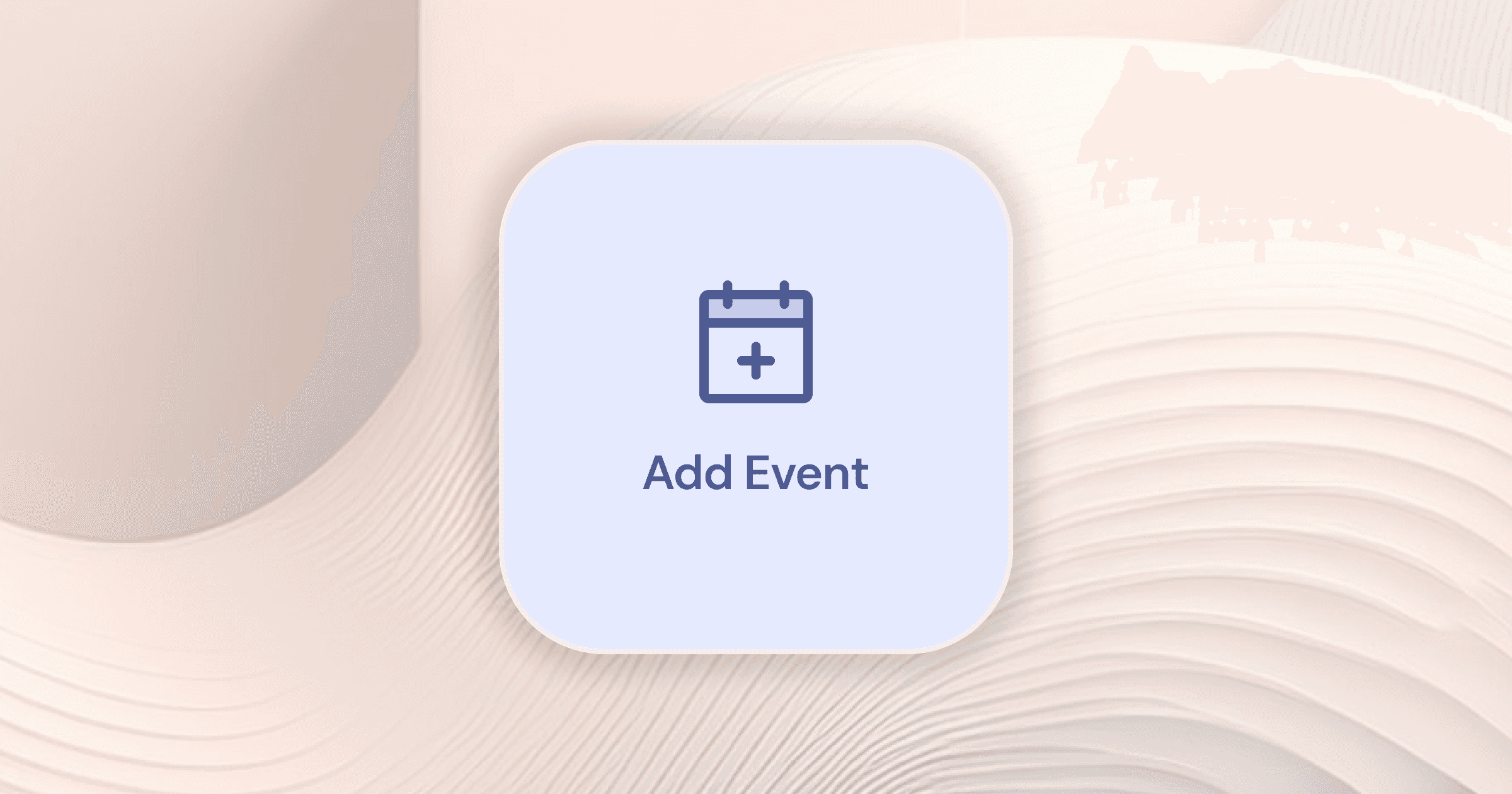
An image of an empty state prompting the user to add information

How to improve copywriting in SaaS apps

Copywriting to bring clarity to your user experience and sprinkle your brand tone into your app. Use clear labels to guide users through your app's interfaces. Good copywriting improves the user experience by helping users reach goals with confidence.

Use your target market and brand guide to establish content guides for your product. Apply consistent and clear labels through your product. Conduct usability testing to understand how your users are interpreting product copy. Make sure that your content is easy-to-understand by your audience, and driving the desired outcomes for them.

How responsive design impacts software UX

Responsive web design is standard nowadays, as it should be. People access products from their phones, tablets, and desktop devices. Make sure your product adapts to different device sizes and optimize your UX for each screen size.

Use google analytics to measure your product usage. Check out what devices and screen sizes your audience is using. Separate key user flows by device size, and find ways to optimize your UX across different screen sizes. Responsive design gives your audience access to your product anywhere they have a supported device with internet.

How to tailor your UX for user types

Apply user research findings to tailor your user experience. Think about your users based on their role, tasks, and desired outcomes. Apply those findings to let users personalize their experience to fit their needs. Let people customize dashboards, preferences, and settings to best fit their needs.

Letting users build their own experience can improve their overall engagement and adoption of a product. Give your customers a sense of ownership over their experience. Be mindful to balance user control and platform difficulty each step of the way.

Why self-service troubleshooting is important

Empower users when they run into issues with your product. Give your audience a way to diagnose, fix, and move on from issues in your UX. Deliver customer support with warnings, help articles, documentation, and steps to fix issues.

Consider presenting users with steps to solve their problem before contacting your team. Check user flows for common issues and provide instructions as people are completing actions. Let users opt into help, with suggestions on how to fix their own issues. Provide a way for people to contact your team if they are unable to fix issues on their own.

Why user-centered experiences are important

Remember to build user-centered product experiences. Proactively look for user feedback and engage your audience to find ways to improve your UX. Identify opportunities to improve, iterate, and expand on your cloud-based software.

Look for feedback on external channels, and engage your user base. Seek out mentions of your product or competitors on social media, and review websites. Find ways to solicit feedback from your active users, and engage in user interviews to uncover more. Innovative experiences are disruptive because they fit a user need.


Real-World Examples of Great SaaS App Design

Spotify digital music streaming service
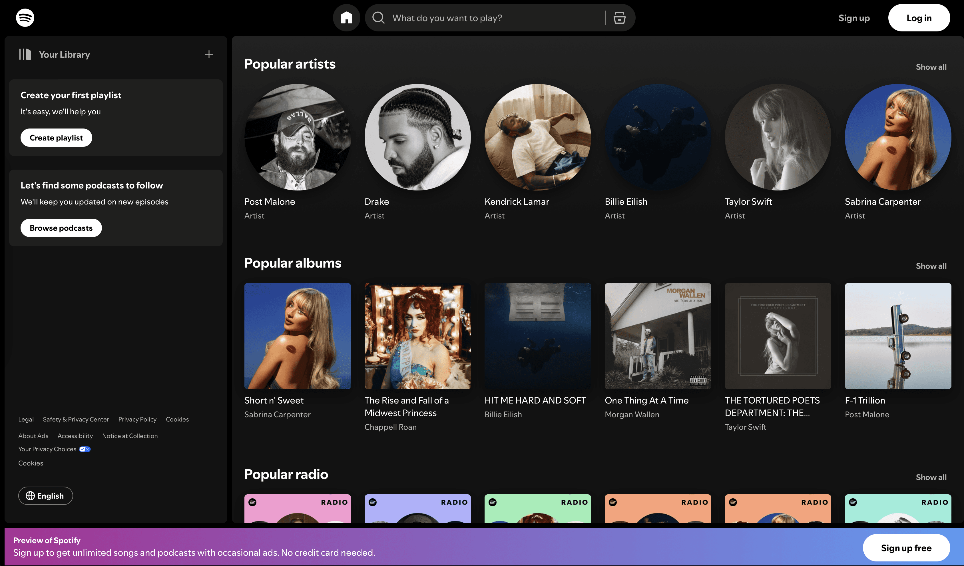
An image of Spotify's website

Spotify is a great example of a SaaS app design that has its own place in the competitive market. With tons of music streaming services, Spotify sets itself apart with a discovery-based interface. Users receive updated suggestions based on their musical taste.

The user interface is a familiar music player with actions that are native to any service. People can cave playlists to share with others, listen to their discover weekly, or find specific songs to listen to. Spotify takes things one step further with user-generated playlists.

Spotify wrapped takes things further with an incredible viral campaign. People get an overview for what genres, artists, and songs they listened to in the past year. People share their unwrapped results each year, providing a way for users to set themselves apart from others with their music taste.

Figma multi-player design tool
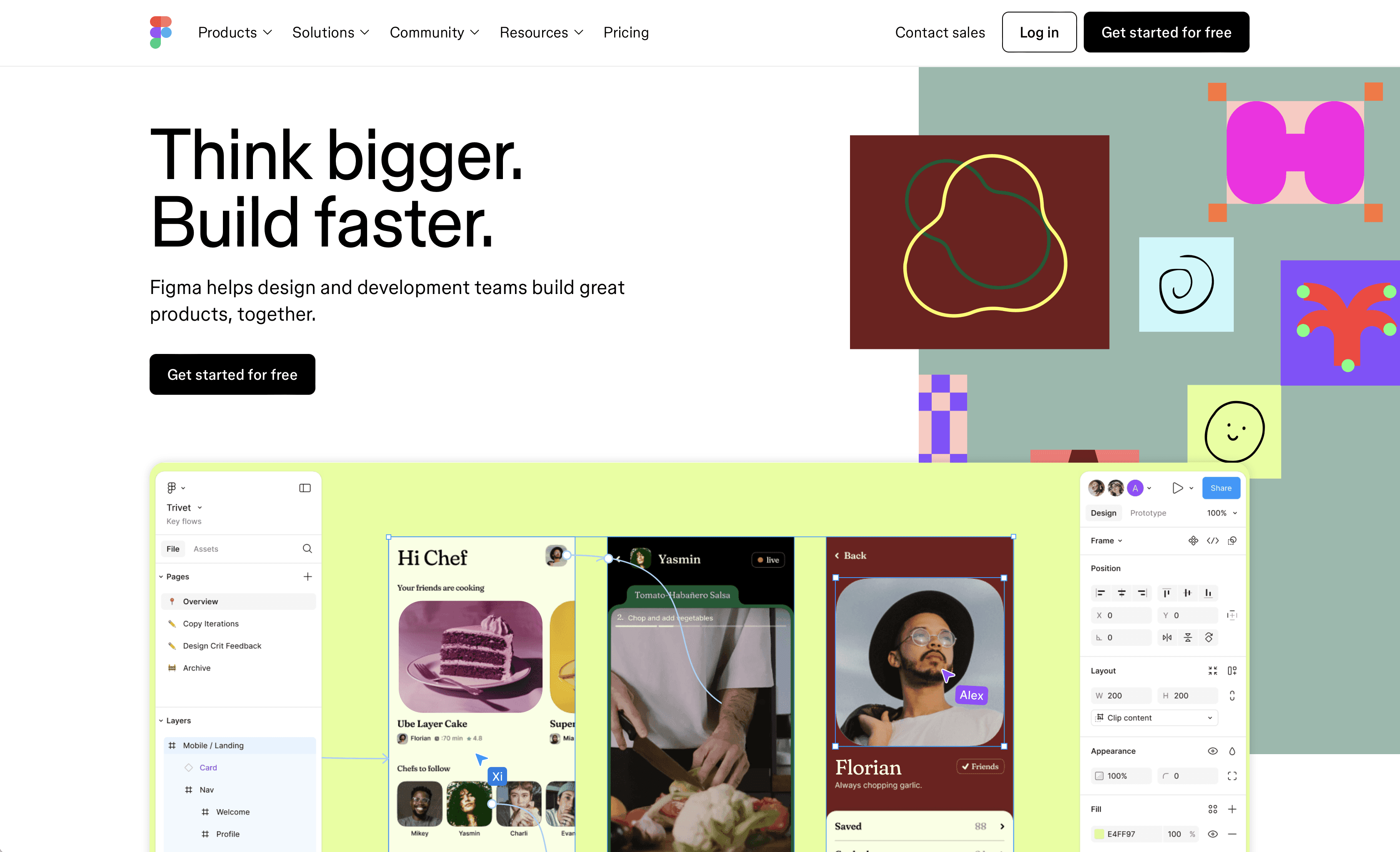
An image of Figma's website

Figma is a great example of adapting to user needs. The design tool originally delivered the same functionality as market leaders like Sketch and Adobe XD. Then closing the gap between development and design with auto-layout and components. Using collaboration, Figma motivates users to invite others to the platform to collaborate.

The Figma onboarding experience is quick and easy, getting new users right where they want to be. Growing into the market leader in UI design tools, Figma expands their offerings to empower product teams further. Recently releasing variables to mimic design system tokens/parameters, adding Figjam for cross-functional teamwork, and Slides for presentations.

The platform brilliantly moved design from a silo into the spotlight. With an approachable experience where users can communicate, manage, and complete their action items. Figma has effectively expanded into other markets with effective user and business evaluations.

Wrapping up

Designing user-friendly SaaS apps is an ongoing effort. Involving a deep understanding of your audience and competitors. This article introduces UX design best practices and examples to get you started.

Remember, building great products is an iterative process. Look for opportunities, test assumptions, and figure out what works best over time. Keep your user experience evolving to meet the needs of your customers. Maintain your competitive edge to succeed in the long-run.

Ready to get started?

Let’s create an impactful experience together. 

Ready to get started?

Let’s create an impactful experience together. 

Ready to get started?

Let’s create an impactful experience together.